

Understanding Forex Chart Patterns with PDF Guides
📈 Master key Forex chart patterns to boost your trading decisions. Learn how to spot trends and access handy PDF guides for practical, local trading insights.
Edited By
Sophie Reynolds
Forex chart analysis forms the backbone of informed currency trading. Without a solid grasp of how to read and interpret charts, traders risk making decisions based on guesswork rather than facts. This section introduces the basics you need to start making sense of forex charts—and get you confidently navigating price patterns, indicators, and different timeframes.
Unlike stocks or commodities, forex markets move 24 hours a day due to multiple international centres operating across various time zones. This can make charts appear complex at first glance. However, by breaking down the components, you can quickly spot trends, reversals, and key price levels.

Most forex traders work with candlestick or line charts. Candlesticks display open, high, low, and close prices within a chosen timeframe, making them prime for spotting patterns such as pin bars or engulfing candles. Line charts simplify price data by connecting closing prices, useful for grasping overall direction at a glance.
Familiarity with your chart type helps you identify signals sooner and respond faster to market changes.
Forex charts come with varying timeframes—from one-minute ticks to monthly views. Shorter timeframes (5 to 15 minutes) suit day traders chasing quick moves, while medium (4-hour) to longer (daily or weekly) charts help investors spot broader trends and avoid noise.
Patterns like double tops, head and shoulders, and triangles often hint at potential price moves ahead. Combining these formations with technical indicators—such as the Relative Strength Index (RSI) or Moving Averages—adds layers of confirmation. For example, a bullish breakout confirmed with rising RSI can signal a strong buy opportunity.
PDF guides and cheat sheets are handy tools for referencing these chart features without sifting through lengthy texts. They organise complex information into digestible summaries, ideal for keeping on your device or printing out for quick review during trading hours.
This foundation prepares you for deeper exploration into forex chart analysis techniques. From the next sections, you'll gain practical insights into advanced pattern recognition and indicator application tailored to South African traders and international markets alike.
Forex chart analysis lays the groundwork for making smart decisions in currency trading. Knowing how to read charts helps you spot trends, identify potential reversals, and time your entries and exits better. Unlike just guessing market moves, chart analysis gives you a clearer picture of price action, which can be a game plan when volatility hits, especially during active sessions like the London or New York trading hours.
Line charts are the simplest form of forex charts, connecting closing prices over a set time. Imagine plotting the closing price of the USD/ZAR pair every hour and joining those points to form a line. This makes it easy to observe overall trends without distractions. But, the drawback is they don't show intra-period moves, so sudden price spikes or retracements that happen during that hour won't be obvious. For quick, straightforward trend checks, they're neat – for example, to confirm direction before opening a position.
Candlestick charts add more depth by representing the open, high, low, and close prices within a time period with a 'candle'. These candles show you not just direction but also market sentiment. A long green candle might mean buyers are pushing strongly, while a doji candle, which looks like a cross, signals indecision. Traders often use candlestick patterns like hammers or engulfing candles to anticipate reversals. This style is particularly popular in the forex scene because it offers clear, visual clues about momentum shifts.
Bar charts are somewhat like candlesticks but use vertical lines (bars) to display high and low prices, with horizontal ticks showing open (left) and close (right). They provide similar information but with less visual impact than candlesticks. Some traders prefer bars for precision and detail. For instance, when watching the EUR/USD pair, a sudden long upper shadow on a bar chart indicates rejection of higher prices, hinting sellers might be stepping in.
Bid and ask prices form the backbone of forex trading. The bid price is what buyers are willing to pay for a currency pair, while the ask price is what sellers want. The difference between them is the spread — your implicit transaction cost. For instance, in USD/ZAR, if the bid is R18.30 and the ask is R18.33, you start off with a 3-cent hurdle to cover before making a profit. Tight spreads often mean lower costs and more flexibility, crucial for traders dealing with large volumes or scalping.
Price action basics focus on how prices move without necessarily relying on indicators. By reading candlestick patterns, trendlines, and support or resistance levels, you get a feel for market emotions. Price action traders in the forex market often watch key psychological levels, like round numbers (e.g., USD/ZAR at R18.00), where price tends to react strongly. For example, if the price consistently bounces off R18.00, that level becomes a support to watch for potential buying opportunities.
Role of supply and demand underlies every price movement in forex trading. When demand for a currency pair rises, prices go up; when supply weighs heavier, prices fall. This push and pull create the swings on your charts. Say, if South Africa releases favourable economic data, demand for the rand might spike, pushing USD/ZAR lower. Spotting shifts in supply and demand zones on charts helps you anticipate where price may stall or reverse.
Understanding these basics isn’t just theory – it’s about recognising real market behaviour to trade smarter and reduce guesswork.
Recognising key chart patterns is a fundamental skill for forex traders. These patterns reflect market psychology, showing where buyers and sellers might gain or lose control. By spotting them early, you can improve the timing of entry and exit points, helping manage risk and boost potential returns.
The head and shoulders pattern signals a likely reversal in trend, often from an uptrend to a downtrend or vice versa. Picture three peaks: the middle one (the head) is higher than the two shoulders on either side. It’s practical because it marks when an established trend is weakening, hinting at a pullback or a reversal. For instance, on the EUR/USD daily chart, this pattern may appear before a significant drop, giving traders a heads-up to tighten stops or consider short positions.
A double top appears when price hits a resistance level twice but fails to break through, suggesting sellers are taking charge. Traders spot this pattern to anticipate a downturn after an uptrend. Similarly, a double bottom shows buyers stepping in strongly at a similar support level twice, pointing to a possible upswing. These patterns offer good signals for setting clear stop-loss levels. Say the ZAR/USD pair shows a double bottom near a key level, it might be the green light for traders to buy in, expecting a price bounce.

When price hits the same barrier three times without breaking it, it’s called a triple top (resistance) or triple bottom (support). While rarer, these patterns carry extra weight because they reflect persistent rejection at key levels. This makes them reliable signals for reversal. For example, the GBP/USD might form a triple top on a four-hour chart before sending prices south. Traders often watch for volume confirmation to validate these patterns.
Triangles reflect market indecision but tend to resolve in the direction of the prior trend. They come in three flavours: symmetrical, ascending, and descending. Symmetrical triangles occur when price range narrows, signalling a pause before the trend continues. Ascending triangles suggest bulls preparing to push higher, while descending triangles hint at bearish continuation. In practical use, catch a breakout from the triangle and ride the momentum. For instance, an ascending triangle on the USD/JPY daily chart can foreshadow a strong up move.
Both flag and pennant patterns are short-term continuation signals after sharp price moves. Flags look like small rectangles slanting against the trend, while pennants resemble small symmetrical triangles. These are handy to know because they indicate a brief pause before the trend resumes. Say the AUD/USD rallies strongly and then forms a small flag – a breakout above the flag’s resistance is often a signal to join the uptrend.
Rectangles show consolidation between well-defined support and resistance levels, like price bouncing between two parallel lines. They occur often before the market chooses direction for the next move. Traders watch for breakouts past these lines to confirm a continuation or reversal. For example, a rectangle zone on the USD/CAD four-hour chart can offer clear zones to place orders, stops, and targets.
Chart patterns aren’t foolproof, but when combined with other tools and sound money management, they give traders an edge in the complex world of forex.
Understanding these key patterns helps traders anticipate market moves rather than reacting blindly, making forex chart analysis a valuable part of a disciplined trading strategy.
Technical indicators add a fresh perspective to chart analysis by quantifying price data into useful signals. While charts show raw price movement, indicators help filter noise and identify trends, momentum, and market strength. Combining them can give you a clearer edge — spotting setups that pure chart analysis might miss. For instance, a moving average crossover might confirm a breakout you first suspected from a candlestick pattern.
That said, relying solely on indicators can mislead, especially when they lag price action. The key is knowing which indicators suit your trading style and how to interpret them in context. You’ll see practical examples ahead with moving averages, momentum tools, and volume/volatility indicators.
Simple moving average (SMA) averages closing prices over a set period, smoothing short-term fluctuations. Traders often watch the 50-day and 200-day SMAs for trend direction — when price trades above these averages, it signals bullish momentum, and vice versa.
For example, if the 50-SMA crosses above the 200-SMA, known as a "golden cross", it may indicate a rally is starting. Conversely, a drop below these averages often warns of weakness. The SMA’s straightforward calculation makes it a popular choice, but it reacts slowly to rapid price changes.
Exponential moving average (EMA) gives more weight to recent prices, making it quicker to respond than the SMA. This feature suits short-term traders looking to catch trends earlier. The 12-day and 26-day EMAs, for example, are widely used in forex to spot early shifts.
Picture a day trader watching the EUR/USD pair who notices the 12-EMA crossing above the 26-EMA — this may prompt a quick buy before the full trend matures. However, the EMA’s sensitivity means it can produce false signals during choppy markets, so combining it with other tools is wise.
Relative strength index (RSI) measures the speed and change of price movements, scaling from 0 to 100. An RSI above 70 suggests the asset is overbought and could see a pullback, while below 30 implies oversold conditions and potential bounce.
If you catch GBP/ZAR around an RSI of 75, it might be time to tighten stops or prepare for a reversal. Although RSI helps identify turning points, it is best paired with price pattern confirmation to avoid premature exits.
Moving average convergence divergence (MACD) tracks the relationship between two EMAs to reveal momentum shifts and trend strength. Traders look for MACD line crossovers, divergence with price, and the histogram’s shape for insights.
Say the MACD line crosses above the signal line just as the USD/ZAR breaks a resistance level; this dual confirmation can support entering a long position. The MACD’s blend of trend and momentum makes it a versatile tool, but it works best in markets with clear directional moves.
On-balance volume (OBV) adds volume on up days and subtracts on down days, indicating whether volume confirms price moves. Rising OBV with rising price suggests strong buying interest, useful for validating trends.
Imagine you see a rising rand pair with increasing OBV – this could signal sustained demand, while falling OBV warns of weakening conviction behind the move. Since volume data can be limited in forex, ensure your broker provides reliable info.
Bollinger Bands plot volatility by lining an SMA with bands above and below based on standard deviations. When bands contract, low volatility may be about to burst into a move; expansion suggests strong current momentum.
For example, narrowing bands on the ZAR/USD might precede a volatility spike, signalling a breakout opportunity. When price continuously hits upper or lower bands, it can hint at overextension, guiding decisions on entry or exit points.
Combining technical indicators with chart patterns doesn’t just add tools—it sharpens your sense for the market’s rhythm and likely moves. The trick is to use indicators as guides, not gospel, checking their signals against price action and context.
Using the right technical indicators alongside charts will help you make better-informed decisions, adapting to different market conditions and refining your trading strategy over time.
Picking the right timeframe for forex chart analysis matters a great deal because it shapes how you see market movements and make trade decisions. Different timeframes suit different trading styles — what works for a scalper won’t necessarily work for a position trader. You should consider your own trading goals, risk appetite, and how much time you can dedicate to watching the markets.
Scalpers and day traders focus on short bursts of action, usually within minutes or hours. They rely on charts like the 1-minute, 5-minute, or 15-minute timeframes to capture small price moves. For instance, a trader scalping the EUR/USD might spot a quick reversal on a 5-minute chart to enter and exit trades rapidly. This approach needs constant attention and quick reflexes, often with tight stop-loss limits because price swings can be sudden and fast.
Swing traders and position traders work on a longer horizon, holding trades from days to weeks or even months. They tend to use daily or weekly charts to identify larger trends and more stable patterns. For example, a swing trader analysing the GBP/ZAR pair might look at daily charts to find entry points during a retracement in an overall upward trend. This style suits traders who can’t monitor the markets all day but want to catch bigger moves.
Using multiple timeframes in a top-down approach means starting with a higher timeframe (like weekly or daily charts) to understand the general trend, then zooming into lower timeframes (4-hour or 1-hour) to fine-tune your entry and exit points. This method helps you align your trades with the bigger market picture, reducing the risk of going against the dominant trend.
For instance, seeing a bullish weekly trend but bearish signals on a 1-hour chart suggests waiting for the short-term dip to end before buying.
Confirming trends by checking different timeframes makes your trade setups more reliable. If you spot an upward trend on the daily chart and see similar bullish patterns on the 4-hour and 1-hour charts, you’re more confident the move has strength. Conversely, conflicting signals across timeframes mean caution — the market may be indecisive or about to change direction.
By mixing timeframes, traders get a clearer perspective, balancing the big picture with short-term details. This layered view sharpens decision-making and helps manage risks better in a market as volatile as forex.
Forex chart analysis PDFs serve as handy companions for traders at all levels, offering structured knowledge that complements live chart observation. They provide a straightforward way to study patterns, indicators, and strategies without relying solely on an internet connection or complex software. Whether you're at home or on the move with limited data, having offline access ensures you can review key concepts anytime.
Offline reference
Being able to consult forex analysis material offline eliminates the need for constant internet access, a major advantage in areas with patchy coverage or during Eskom loadshedding. Instead of scrambling for data to look something up on the spot, you can flip open a PDF on your tablet or phone. This also helps during quick revisions before market opening or important trading sessions.
Printable guides
Having a printable format means you can create physical notes or cheat sheets tailored to your trading style. Some traders prefer marking up charts and strategies on paper, especially during discourses or coaching sessions. Printed guides also come in handy if you want to keep a tangible archive next to your workstation, making it easier to cross-reference without switching screens.
Structured learning
Forex PDFs often break down complex topics into clear chapters or sections, making it easier to follow a step-by-step approach. This structure supports focused study, allowing you to revisit specific concepts like candlestick patterns or moving averages without sifting through unrelated web content. For example, a PDF from a specialised provider might guide you from beginner basics to advanced setups in digestible portions.
Broker websites and educational centres
Many reputable brokers in South Africa, such as IG and FXTM, offer free PDF guides as part of their educational content. These documents usually cover practical, market-tested insights intended to help their clients trade better. Since these materials come directly from established platforms, you can trust their accuracy and relevance.
Forex community platforms
Forums and social trading sites, like MyBroadband's forex section or dedicated Facebook groups, occasionally share PDF resources tailored to specific trading styles or market conditions. These can provide fresh perspectives or localised tips, although it's wise to vet the source carefully to avoid outdated or misleading material.
Specialised training providers
Courses by South African training outfits or international providers often bundle PDFs with video lessons. These are valuable if you want a more comprehensive learning experience backed by professional coaching. For instance, a PDF workbook accompanying a workshop can clarify complex patterns and encourage practical application.
Note-taking and highlighting
PDFs allow you to add personal annotations, highlights, or bookmarks, helping you focus on sections that matter most. By actively marking key points, you engage better with the material, making it easier to remember and apply. Using apps like Adobe Acrobat or Foxit, traders can easily jot down observations and flag common mistakes.
Practising alongside charts
Don’t just read; practice what you learn in the PDF by opening charts on your trading platform simultaneously. For example, after studying a session on head and shoulders patterns, try spotting them in real-time charts. This hands-on approach deepens understanding and builds confidence in your analysis skills.
Updating resources regularly
Forex markets constantly evolve, so relying on outdated PDFs can misguide your decisions. Make it a habit to refresh your library by downloading the latest guides from trusted brokers or providers. This ensures your strategies remain aligned with current market behaviours, regulatory changes, or new technical tools.
Keeping a well-curated, regularly updated collection of forex chart analysis PDFs acts like a personalised toolkit, ready to boost your trading decisions whenever needed.
By combining accessible, trustworthy PDF materials with regular practice and thoughtful review, you’re better placed to read forex charts effectively and navigate the currency markets with greater ease.
📈 Master key Forex chart patterns to boost your trading decisions. Learn how to spot trends and access handy PDF guides for practical, local trading insights.

📈 Master key chart patterns for trading success! Discover their uses, pros, cons & find trusted PDF guides for South African investors wanting to improve skills.

Discover how forex trading bots operate, their pros and cons, plus tips for South African traders on picking bots and managing risks 🤖📈 Start automating smartly today!
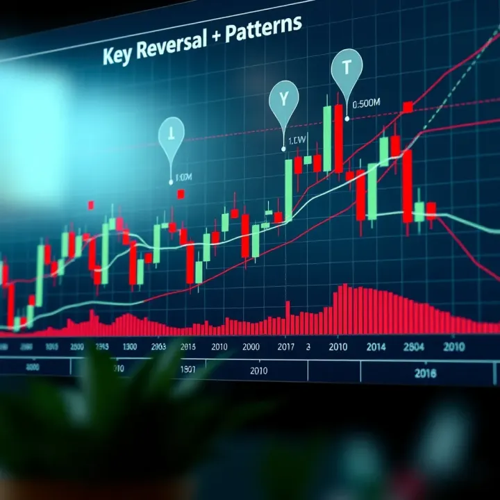
📈 Master reversal chart patterns with this practical guide! Learn how to spot key patterns and use PDFs to sharpen your trading skills in South Africa.
Based on 6 reviews